Pay in parts at Klarna

Shift from financing 1.0 and offer term loans in Austria and Germany

Industry
Fintech
Company
Klarna
Role
Sr Product Designer
Summary
  • Project goal: Introduce a better product offering with instalments called "Term loans" in Austria and Germany.
  • Motivation: Due to more strict market regulations but also errands and at the same time people land in debt without control, Klarna decided to make the product offering more transparent through different initiatives.
  • My role and the team: Senior product designer in a team called Term loans: Purchase flow which consisted of 1 product manager, 1 data analyst and 3 engineers.
  • Activities and tools: Requirements and analysis, flow mapping, high fidelity designs & prototyping, usability testings (with 1 UX researcher), collaboration and workshops with different teams.
  • Results: Launched a new product offering to 200 merchants (in Austria and Germany) and visited by 85.000 consumers. Errand rate decreased by 17%. Optimisations in different parts of the flow are still in progress.
  • Project duration: 4 months to gradually launch the MVP
About Klarna

Klarna is a leading global payments and shopping service, providing smarter and more flexible shopping and purchase experiences to 147 million active consumers across more than 400.000 merchants in 45 countries.
Klarna is divided in different domains (app, payment methods, shopping experience, cards and more).

The background story

Our previous offering at Klarna, with paying in parts, was called credit account. It was called financing 1.0 and was a revolving credit offering that bundles debts from multiple purchases and allows you to do minimum payments. Klarna, has decided that we do not want to offer revolving credit in the future, as it can incentivise people to do minimum payments and take a long time to pay back their debt.

The new way to finance is with Term loans. Term loans allow consumers to pay with instalments for more expensive items and purchases. This payment method targets transparency and manageable financing with a closed-end loan. Customers will be given the terms upfront and will have the ability to set up automatic payments to be taken each month when the instalment is due. It complements other payment methods that are mainly offered for smaller purchases and free for the consumer. Merchants that sponsor the price for Term loans can offer 0% financing or a reduced interest rate. In other cases, the consumer pays interest for the term loan.

We initiate offering Term loans to core markets starting from Austria and Germany.

Change explanation between financing account (old offering) and term loans (new offering)
Investigating current solutions

We started analyzing Klarna's financing purchase flows we already built for different markets (Sweden, Germany, UK, and US). At the same time, we conducted a short competitor analysis (focused mainly on big brands like Paypal and Affirm). We highlighted solutions we could introduce in our flows as well as avoided past inaccuracies based on previous data.

Paypal and Affirm flow mapping
Klarna flow mapping in Sweden and UK
Challenges and understanding customers

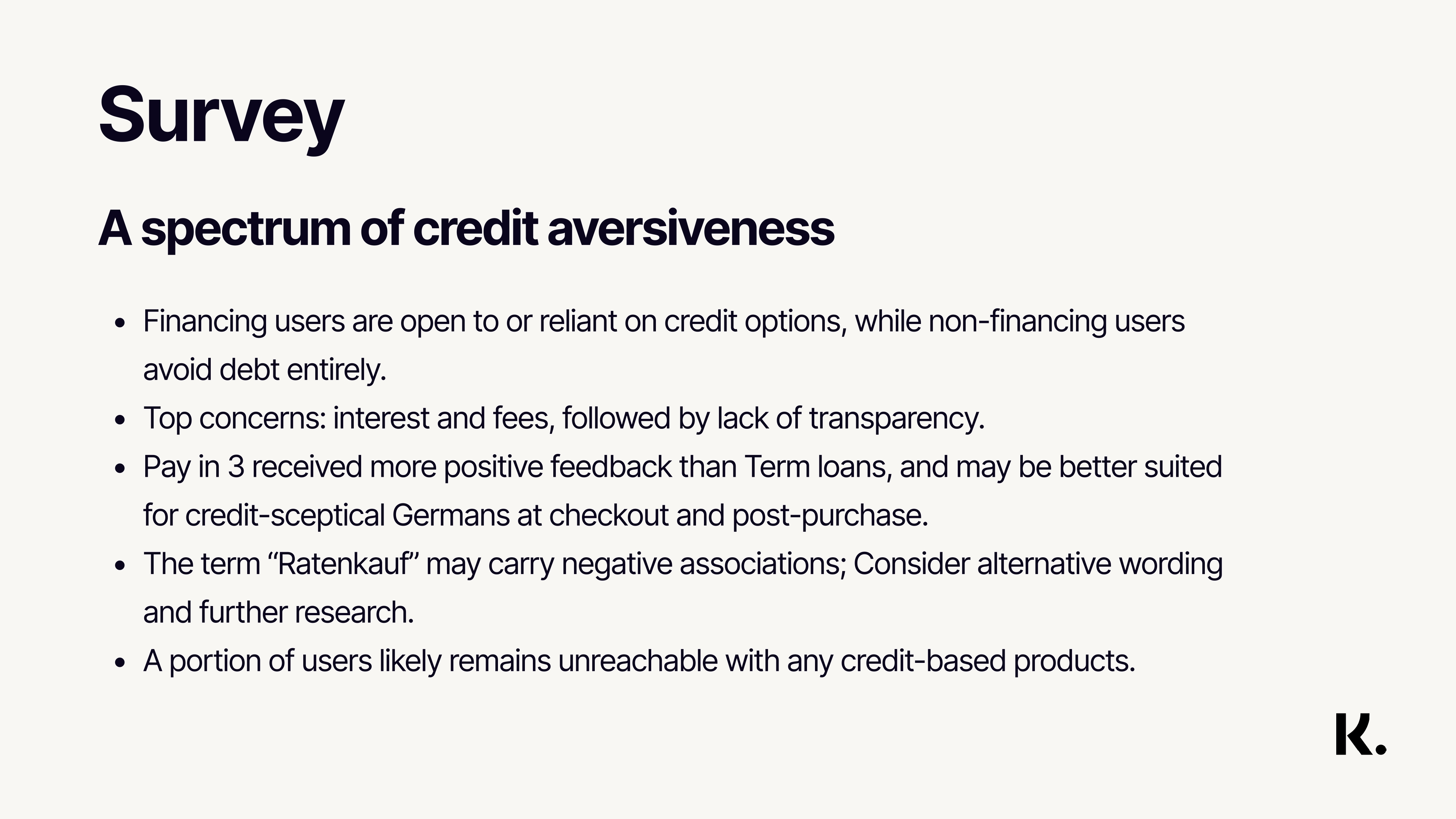
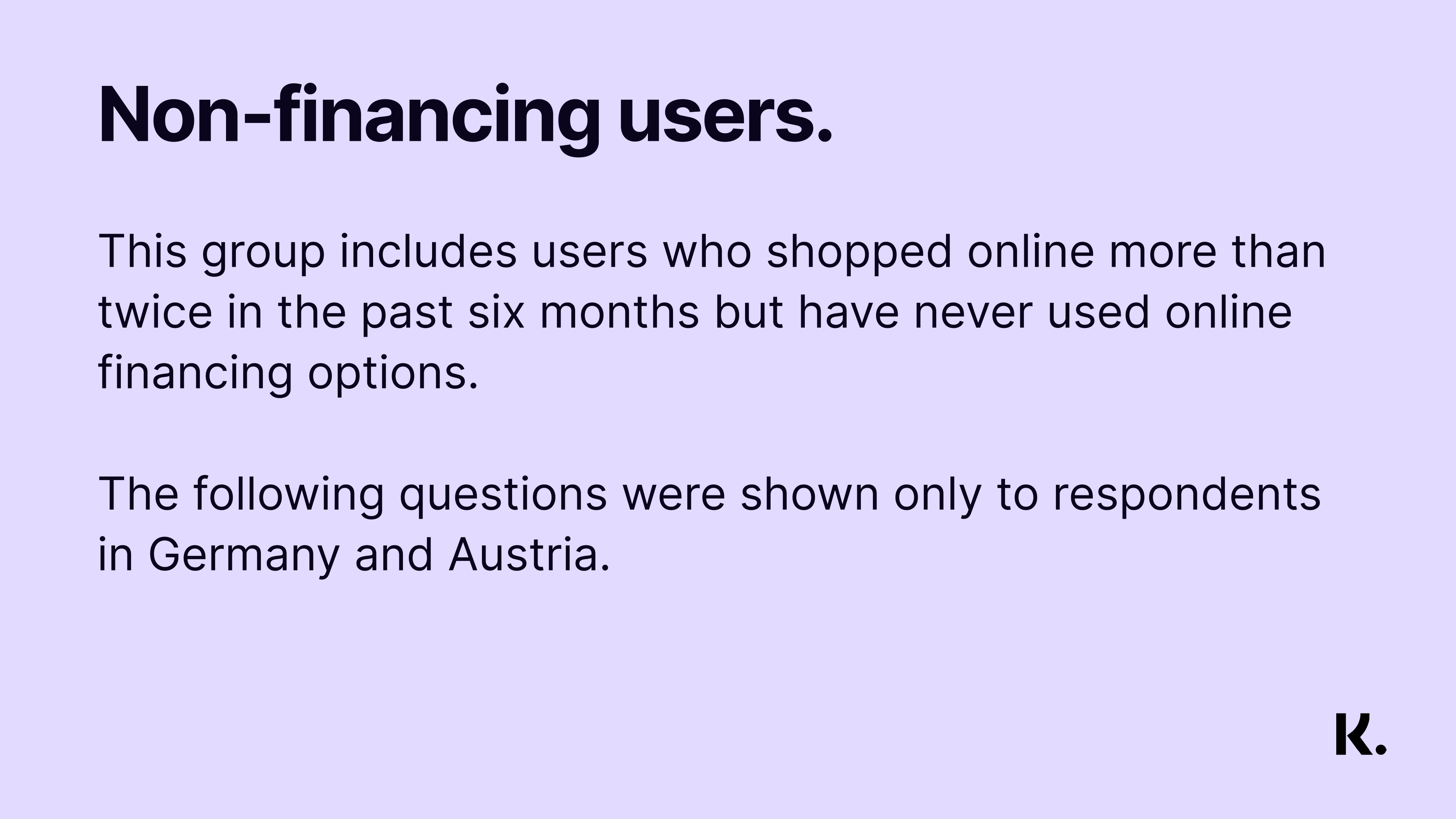
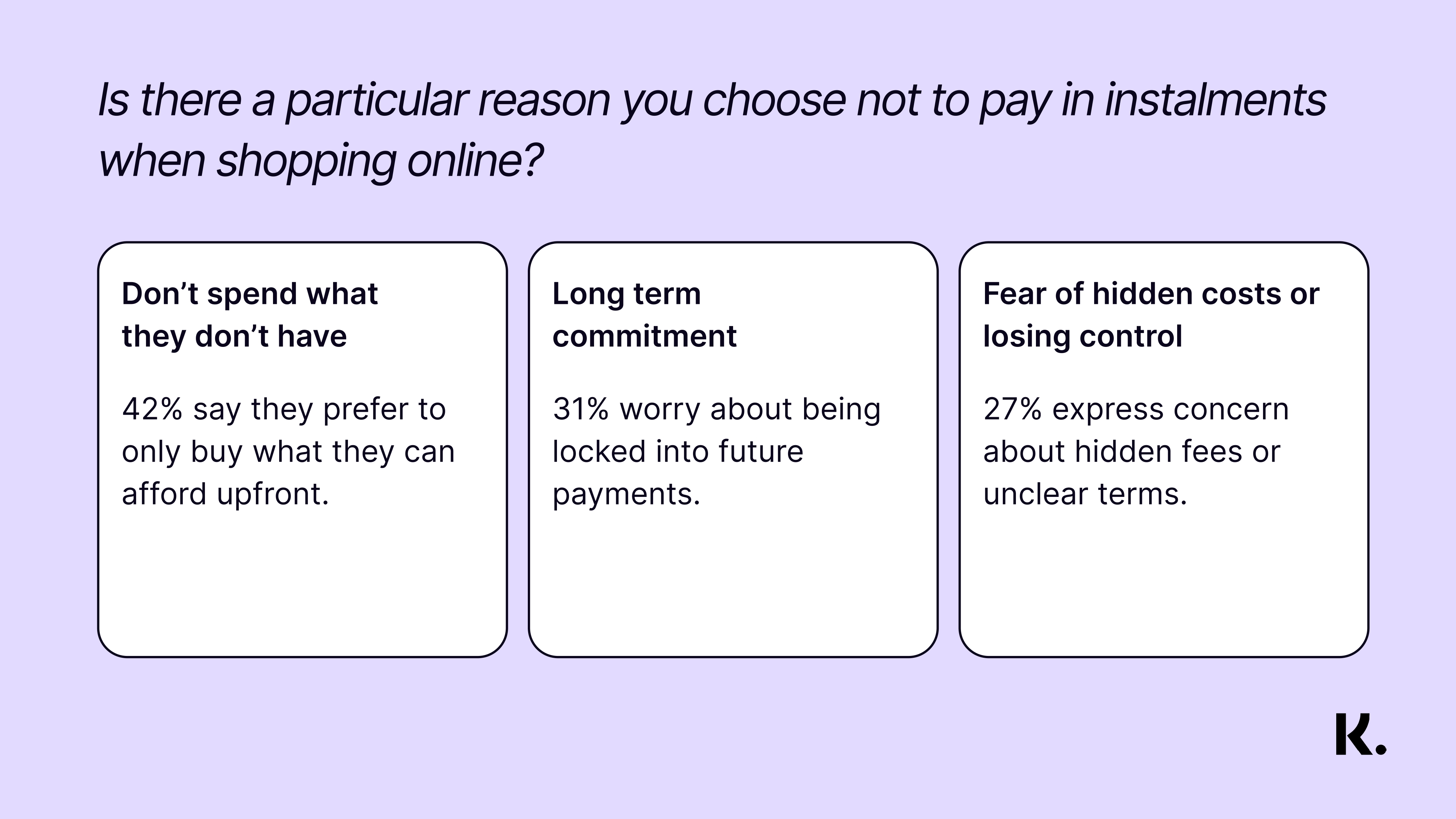
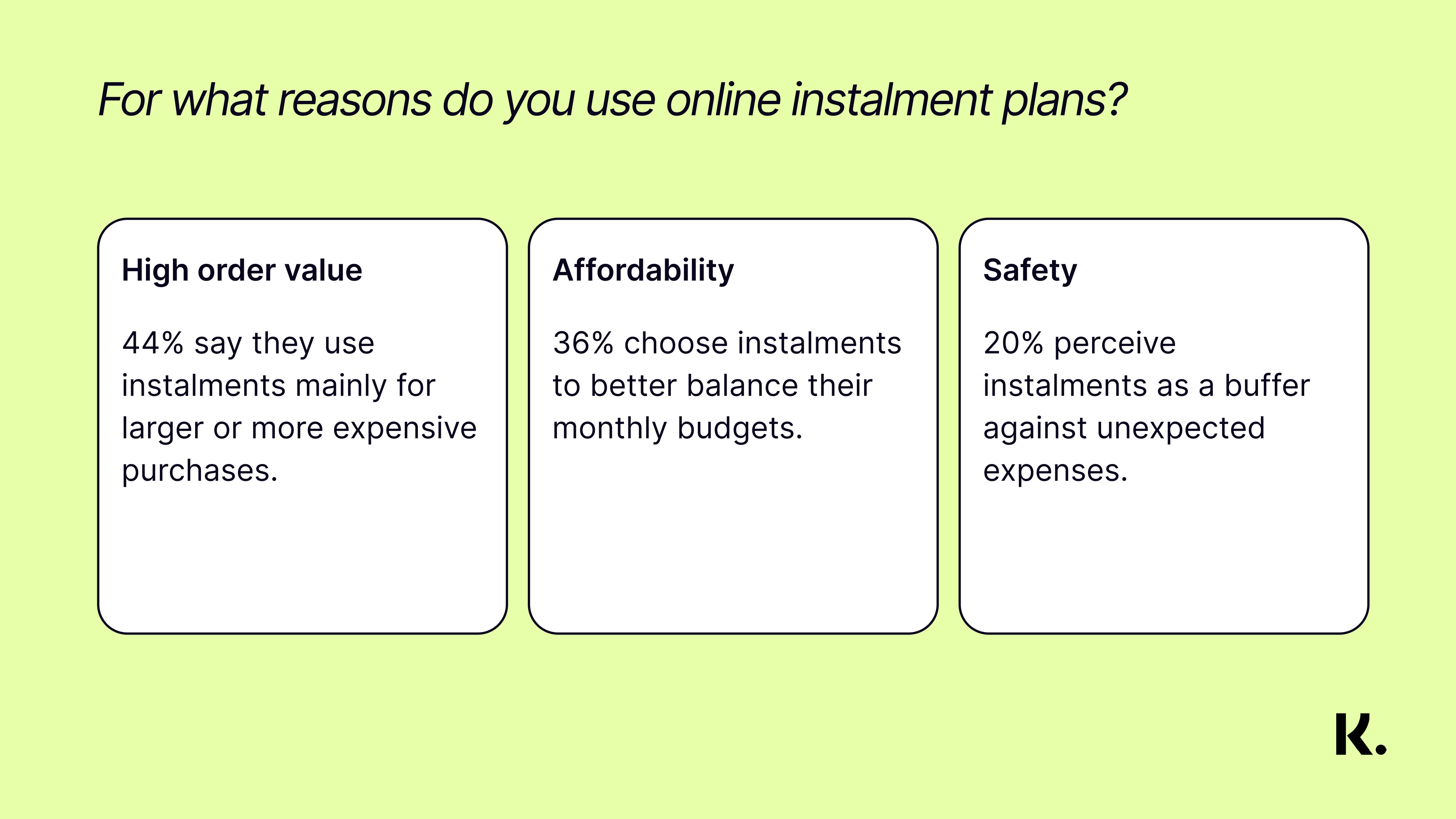
The main challenge in designing for a different market is not being physically there. It is difficult to deeply empathize with the customers' needs and motivations. This gap slightly closes with going over research done before. However, main questions like what meaningful features we should add to the current financing purchase flow were raised all the time. With the help of the EU localisation team, we surveyed 2 different user groups: People who use financing products and people who avoid them (In Austria and Germany).

Survey questions presentation and examples
Decisions, decisions, decisions

Based on surveys, previous research and competitor analysis, we decided to progress with the creation of an MVP with three main changes:

how-does-nimber-work-screen
  • Introduce the Open Banking flow
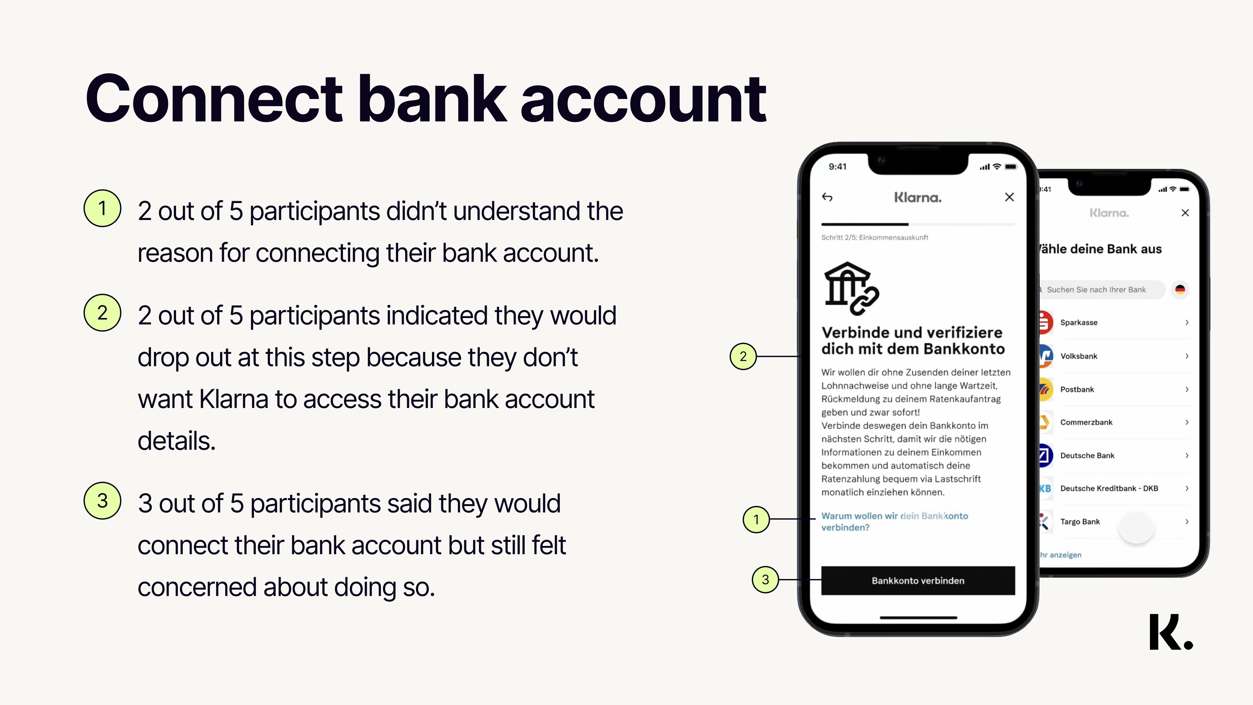
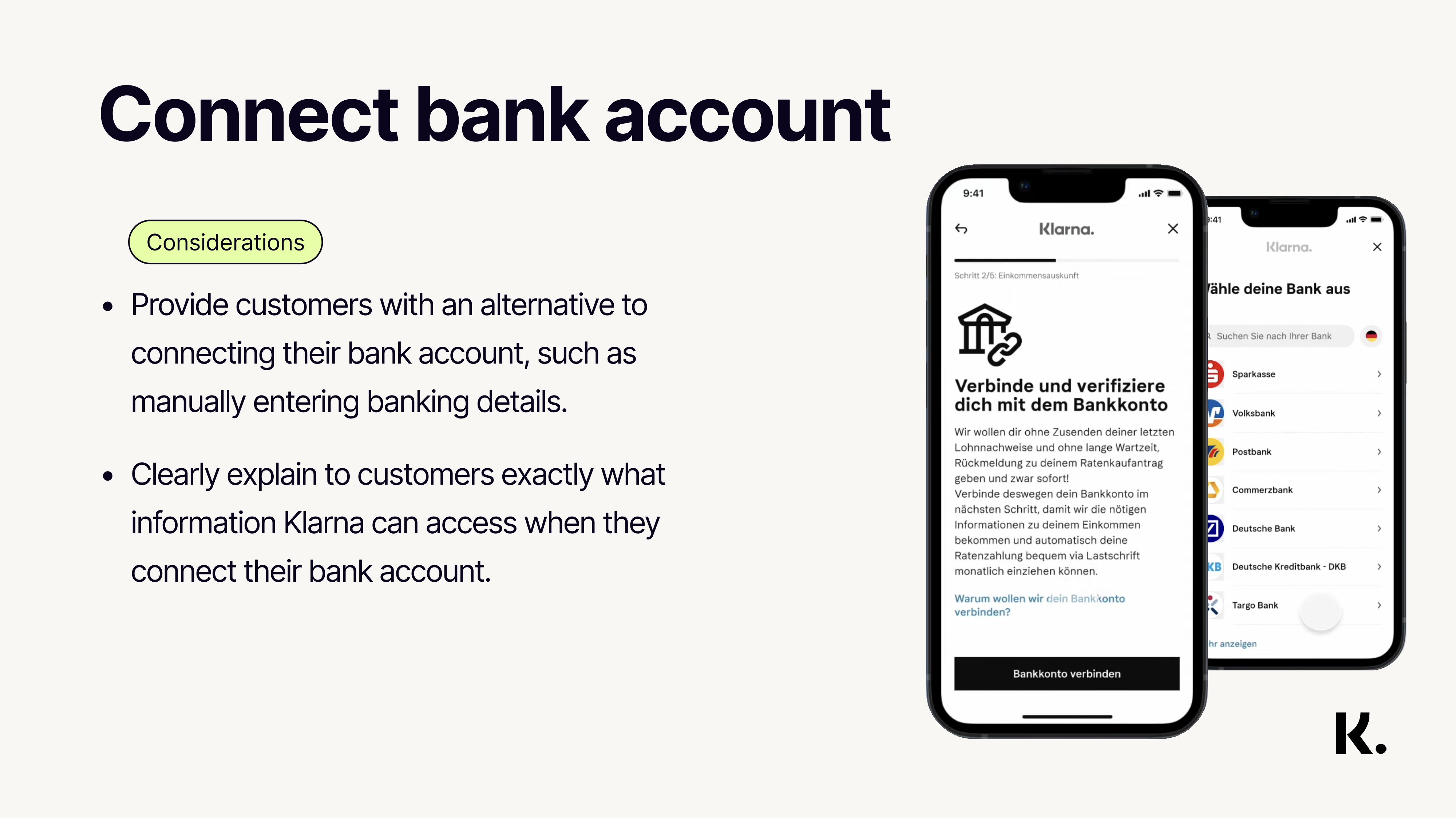
    Customers can quickly connect their bank account and be checked if they are eligible to get a term loan, as well as enable automatic payments.
  • Increase transparency
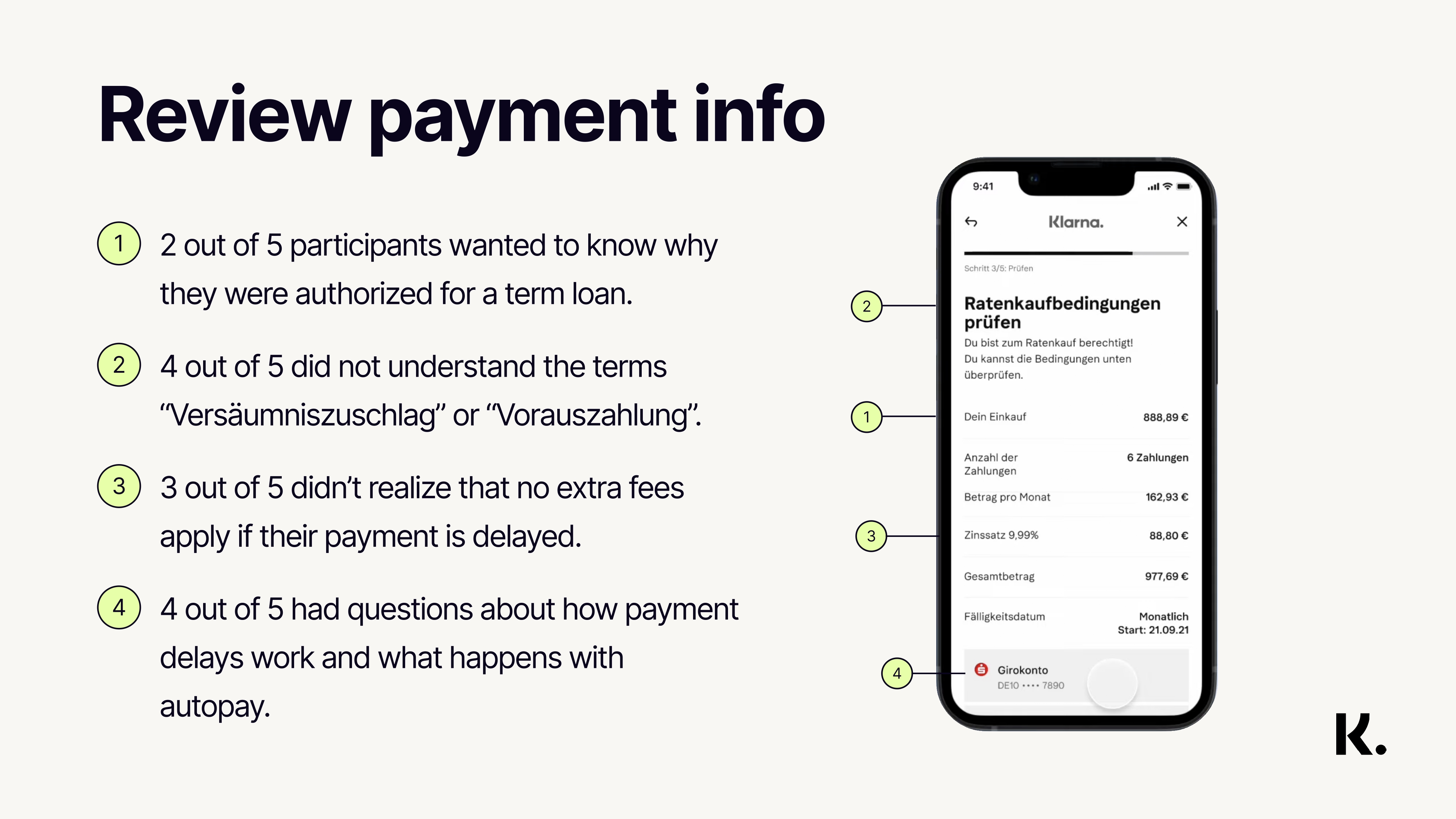
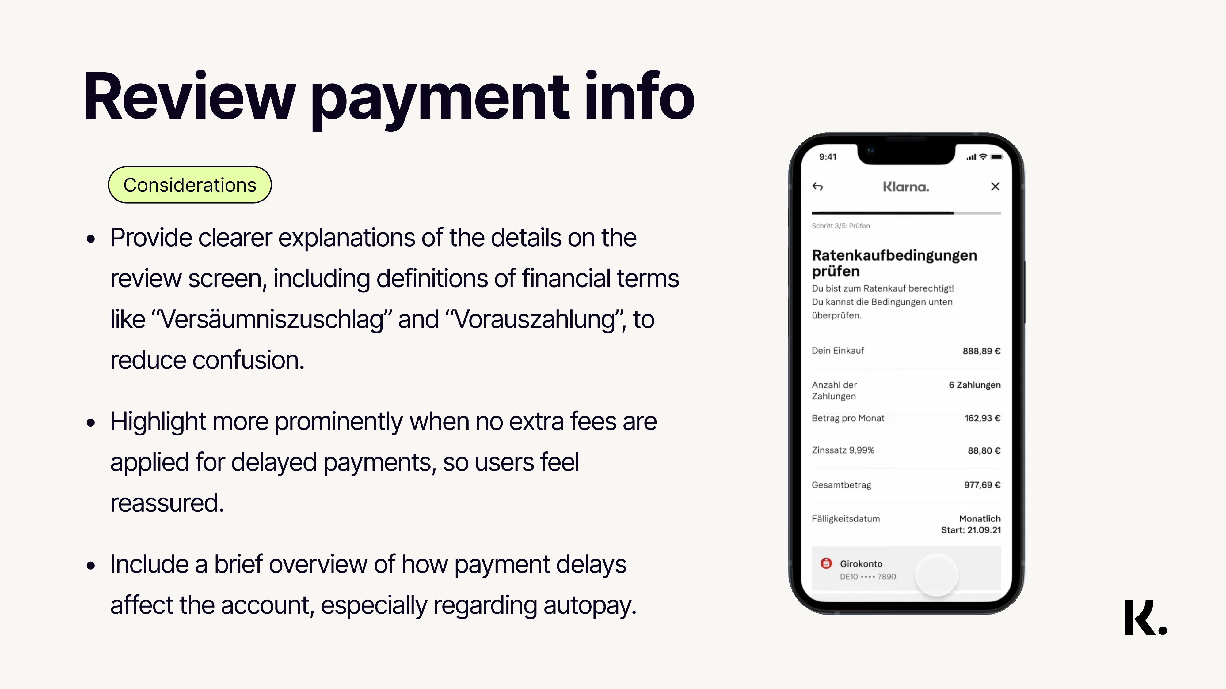
    By providing clear feedback to customers in every step in the purchase flow (e.g., why they should connect their bank account, why they have been rejected).
  • Improve the post-purchase experience
    On mobile app, web app and through e-mails and push notifications.
Validating initial proposals

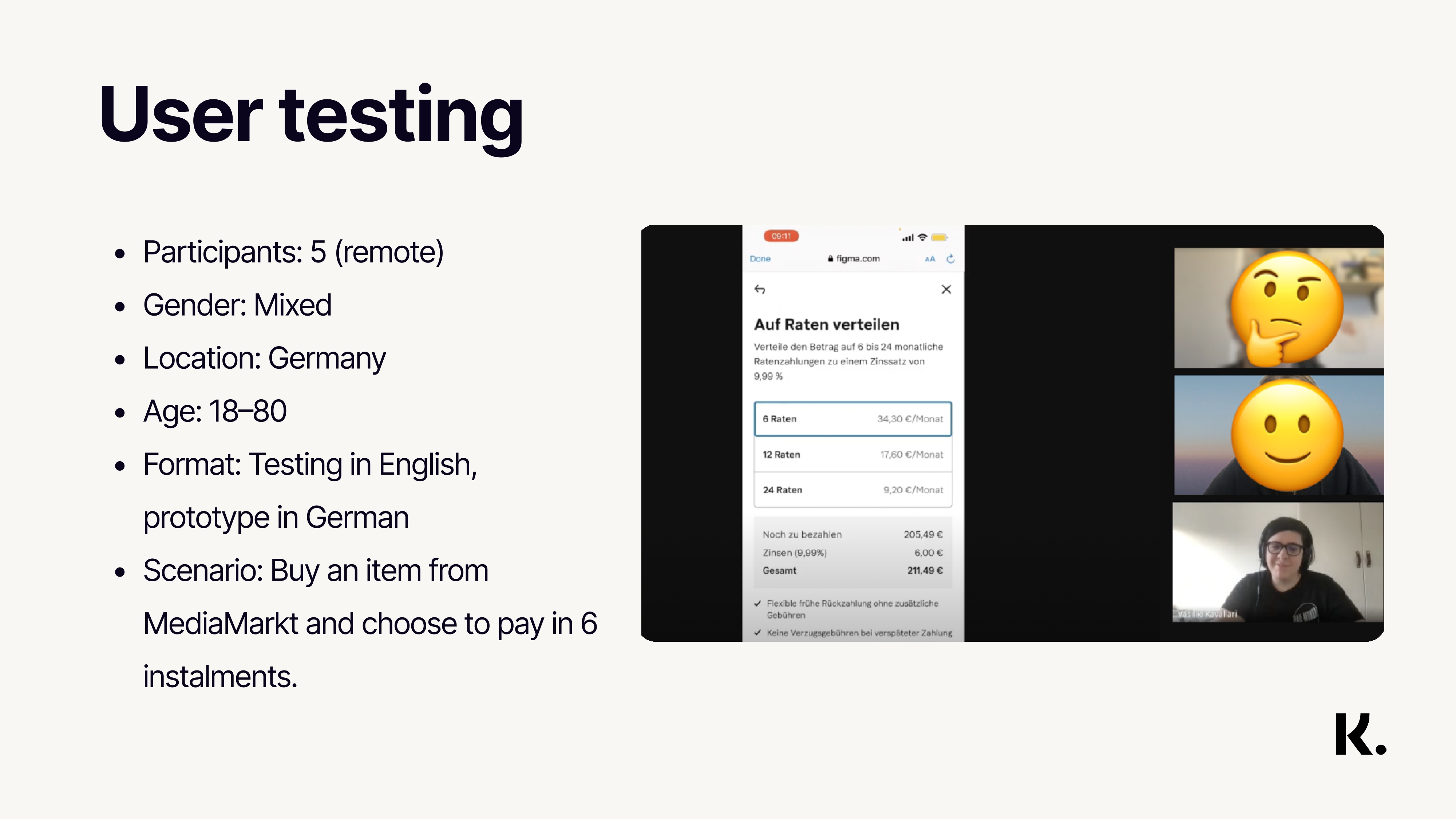
After agreeing with different stakeholders, we created a prototype in German to conduct a remote moderated usability testing with 5 different participants in collaboration with a UX researcher from the EU localisation team.

Research and findings

To conduct the usability testings, we used TestingTime to recruit users from Germany and Austria in combination with Google Meets to conduct a 45 min interviews with 5 participants. Everything was documented in a research plan template we use at Klarna. The main flow tested was to make a purchase at Mediamarkt (a washing machine and a dryer), login into Klarna's account and pay/split it with 6 instalments.
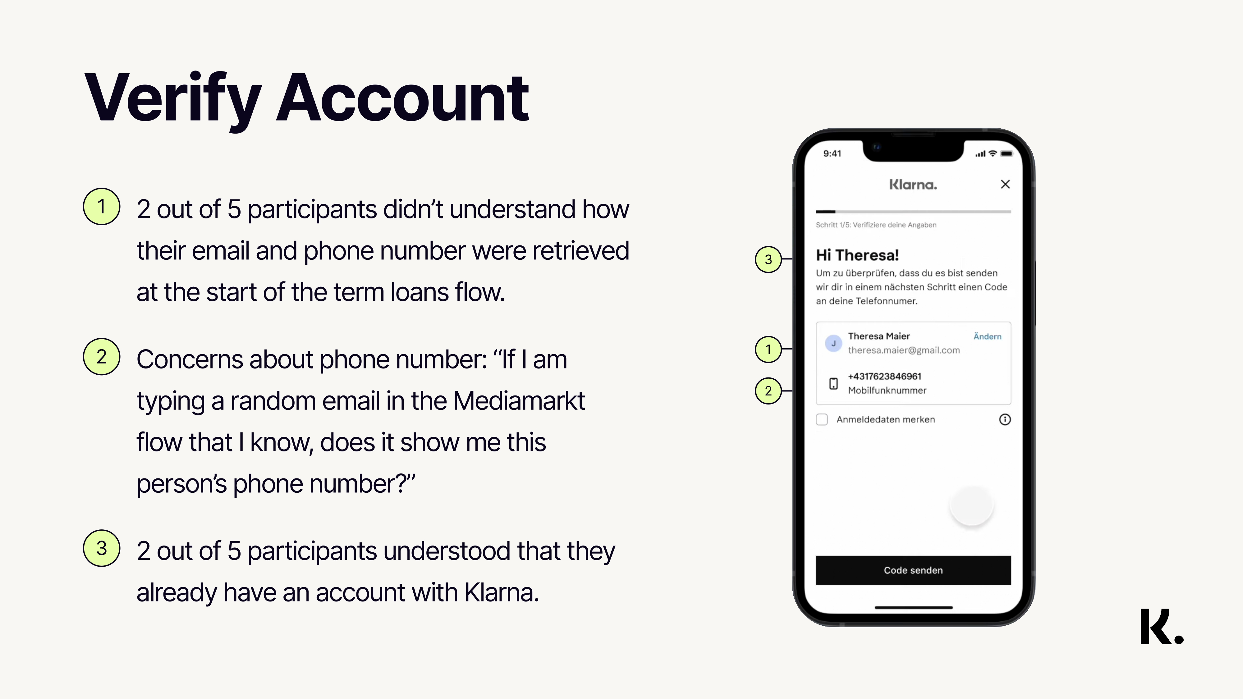
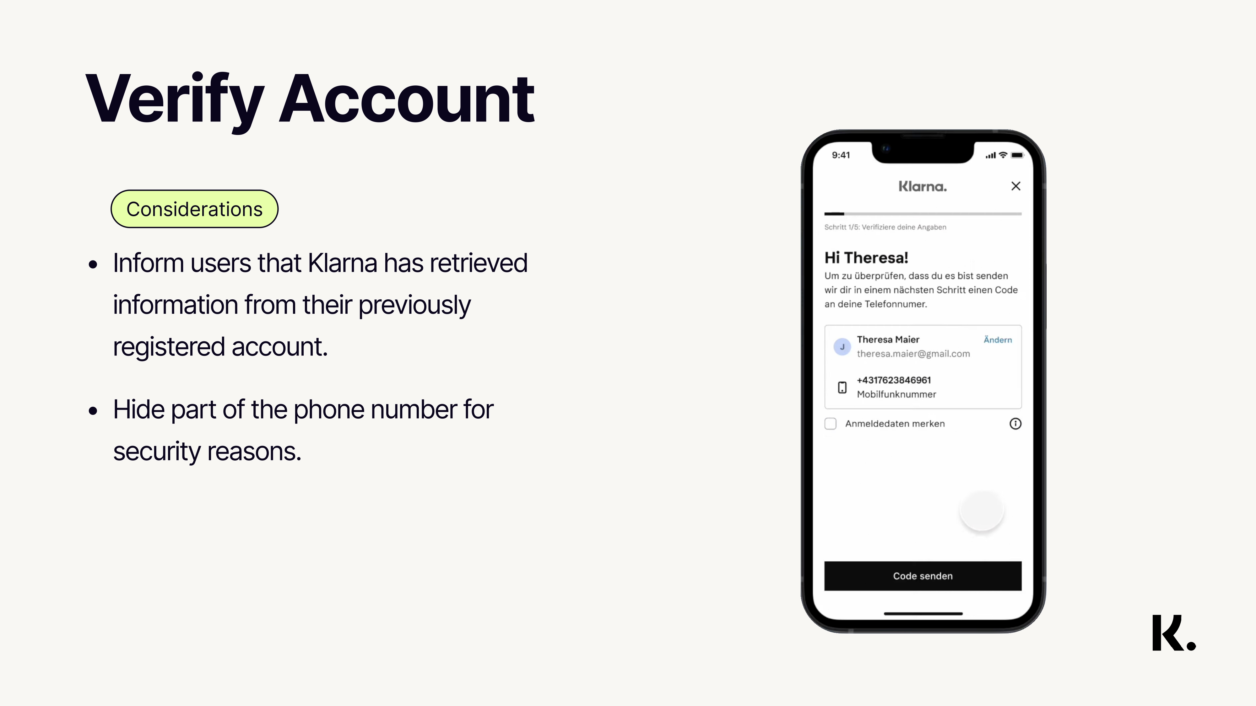
We spent 3 days conducting the interviews and then, in collaboration with the UX researcher we analysed our data and prioritised what is possible to change in the first launch. We also met with different stakeholders to present these findings and be on the same page and at the same time, push for specific changes in different teams.

how-does-nimber-work-screen
Collaboration and co-ordination

At Klarna, the term loans purchase flow consists of multiple cross-functional teams:

  • The payment selector team is responsible for the general functionality of all the payment options as well as the design of it
  • The underwriting team sets the rules and decides which personas are eligible to get a loan as well as who will get rejected and for which amounts and reasons
  • The funding sources team creates the functionalities of collecting credit/debit card information as well as bank account info
  • The open banking team gives the ability to the users to connect their external bank accounts to Klarna
  • The legal team is responsible to check in which parts of the flow Klarna is legally covered as a business, as well as provide all relevant legal information to customers in a clear way
  • The design system team which is responsible for all the components and patterns aligned with Klarna's brand and guidelines

A main part of our job as a team was to co-ordinate with all these teams in order to ship term loans as a full end-to-end consistent flow for consumers.

how-does-nimber-work-screen
user personasuser personas
Deep dive

We decided to prioritise specific changes to progress with the first launch: The payment selector (communicate even better our offer), the connect your bank account screen and the review screen. Amongst different reasons, the main one was that these were core points which will improve significantly the purchase flow. We did not just want to increase conversions with confused customers but we want to increase quality numbers (and trust in the German/Austrian market) in the long-run and decrease errands which the customer service could not always handle.

how-does-nimber-work-screen
Working together

After defining and designing the MVP with key stakeholders and iterating in different weekly critique sessions with other designers, I had to closely collaborate with the developers in my team. Even though we are working in an agile way, with day to day stand ups, I created a weekly meeting with them to align to every detail of the flow; Happy and sad flows, corner cases, error messages, responsive behaviour and so on.
We all benefited from these meetings because we are constantly learning a lot from each other and improving even more our ways of working.

how-does-nimber-work-screen
Results and learnings

By increasing transparency and providing term loans to the German and Austrian market, it was expected to see the benefits in the long run. The assumption was that, by creating more awareness of the product/loan people will land in, we will see more drop-offs but at the same time acquire customers who will make more informed lending decisions.
Our data analyst in the team in collaboration with other analysts from different teams have started measuring (funnel conversion, drop-offs, errands) in the end-to-end purchase flow.
We gradually launched this solution to 50 merchants in Austria and 150 merchants in Germany. Regarding drop-offs, luckily the numbers were similar to the previous solution, but the errand rate (communication to customer service) decreased by 17%.

We are currently investigating (eventually with an A/B testing) on how to improve a specific part of the flow (when the IBAN collection is triggered, based on underwriting decision) in collaboration with the funding sources team since we see 26% drop-offs on purchases lower than 200€.

Klarna logo, the brand name, images and products are copyrighted materials protected by International laws and belong to Klarna.
Other projects at Klarna